I embarked on my first serious foray into programming when I was in school, equipped with a Pentium III Celeron computer, a second-hand Microsoft Press book about Visual Basic 6, and a copy of Visual Studio 6 of questionable legality. I distinctly remember visually creating facsimiles of Windows forms by dragging and dropping controls, which would come to life after running the application.
This visual designing was one of the key features of Visual Basic 6, and so was the fact that it enabled you to create native-looking UI that fit right in with Windows XP’s trademark plastic aesthetic. What is truly great is that I still get a lovely nostalgia trip every time I visit my local bank, pharmacy or restaurant, all of which use applications written in VB 6, but run them on Windows 7+. The once-native UI now looks completely out of place running on the OSes of today.
Native-looking UI was everywhere during the XP era. My web browser, word processor, calculator, IDE, looked just like the rest of my operating system. I don’t think that is the case any more. Somewhere down the line, we largely stopped caring about a having a uniform look across the operating system and its applications.

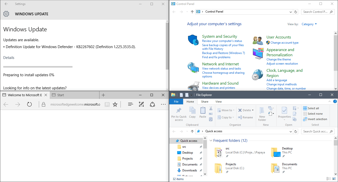
Nowadays, my web browser, my photo editor, my office applications, my IDEs, my text editors, my 3D modeling application all look vastly different. Even Microsoft’s own applications have no consistent design language any more. Microsoft Office (insert any version number here) looks nothing like Microsoft Edge, which looks nothing like Windows Explorer. There’s no consistent look within the same OS either - some control panel options have the flat “modern”look, but dig a little deeper, and you’ll see a Windows 7-style interface. The start menu looks like nothing else in the entire system - it is pulled straight out of the Windows Phone aesthetic. In my experience, Linux is no different.
At least from where I’m standing, the dream of OS-wide consistent native UI sure seems to be dead. And don’t get me wrong - I’m not complaining. I think there are some key advantages to be gained if application developers fully embrace this concept.
I think it’s a good idea to make the UI native to your application rather than making it native to the operating system.
Cross-platform consistency
I actively enjoy using applications like Blender that make no effort to blend into their host OS, choosing instead to look and act uniformly across different OSes.
Note that there are some functional variations that you will have to deal with while designing a cross-platform interface. e.g. Macs have different physical keys and conventions than traditional Windows or Linux machines. Ubuntu uses the alt + drag combo for moving windows around. While this is a common gesture in 3D applications on Windows, it will not work on Ubuntu. Make sure you have alternative ways to go about this function. (Note: I haven’t tried the Unity editor on Linux yet, but I’m curious to see how they have solved this problem.)
Application-platform dissonance
It is apparent now, more than ever before, that commercial OSes and application developers have conflicting interests. OS vendors are interested in creating closed, controlled, curated platforms with “killer” (read: non-cross-platform) apps, while application developers should be focusing on delivering value across OSes. “Official” OS APIs keep changing, and I’m not too happy with a lot of the modern ones.
If you minimize your surface area of interaction with the OS, that is a big win for development and maintenance. Turns out that UI accounts for a lot of that surface area.
Dependency minimization
Library dependencies are a big deal, and unless you pick them frugally and deliberately, they will become a significant contributor to your technical debt. Libraries that emulate OS-native UI solutions, like Qt, come with a huge amount of dependency bloat. Simply choosing not to link GTK, reduces Papaya’s dynamic library dependencies from 61 to 28, on Linux. That’s a lot of extra dependencies just to enable open/save dialog boxes.
On the other hand, I have been extremely happy with ImGui, which has no external linkage dependencies other than OpenGL. ImGui has a very friendly API and a readable and tweakable code base. What’s more, it has a far more permissive MIT license.
Optimum usage of screen real-estate
Application requirements have evolved, and OSes haven’t quite kept up. In my opinion, a large part of the OS-native screen real-estate is wasted in the traditional title bar, especially on Windows. The title bar is thick, colorful, and basically useless. That space is better used for tab-management, like Chrome does on Windows. A lot of applications today have multi-document tabs, and I think this should be an OS-level feature at this point. I’d even like tabs on my calculator. Alas, it is not an OS feature, and OSes choose to basically waste this space.

If you can create a borderless window, having a custom UI actually helps you make better use of the screen space. Linux, unfortunately, has no standardization as to where the close/min/max buttons appear, and so your custom UI will end up non-conformant on one distro or the other. This is what Chrome does on Ubuntu at the moment. You can mix and match these approaches, so Papaya on Windows is borderless with custom window buttons, but on Linux does use the default window chrome.
DPI scaling can also be done far more easily and sanely if you control the entire UI pipeline.
TL;DR
If you develop an application that has a GUI, it is valuable if you embrace a platform-independent mindset early on, in terms of UI design and your choice of UI library. Don’t be native to an OS. Be consistent with yourself across OSes. Choose a lightweight, dependency-free GUI library over a large multi-platform framework.